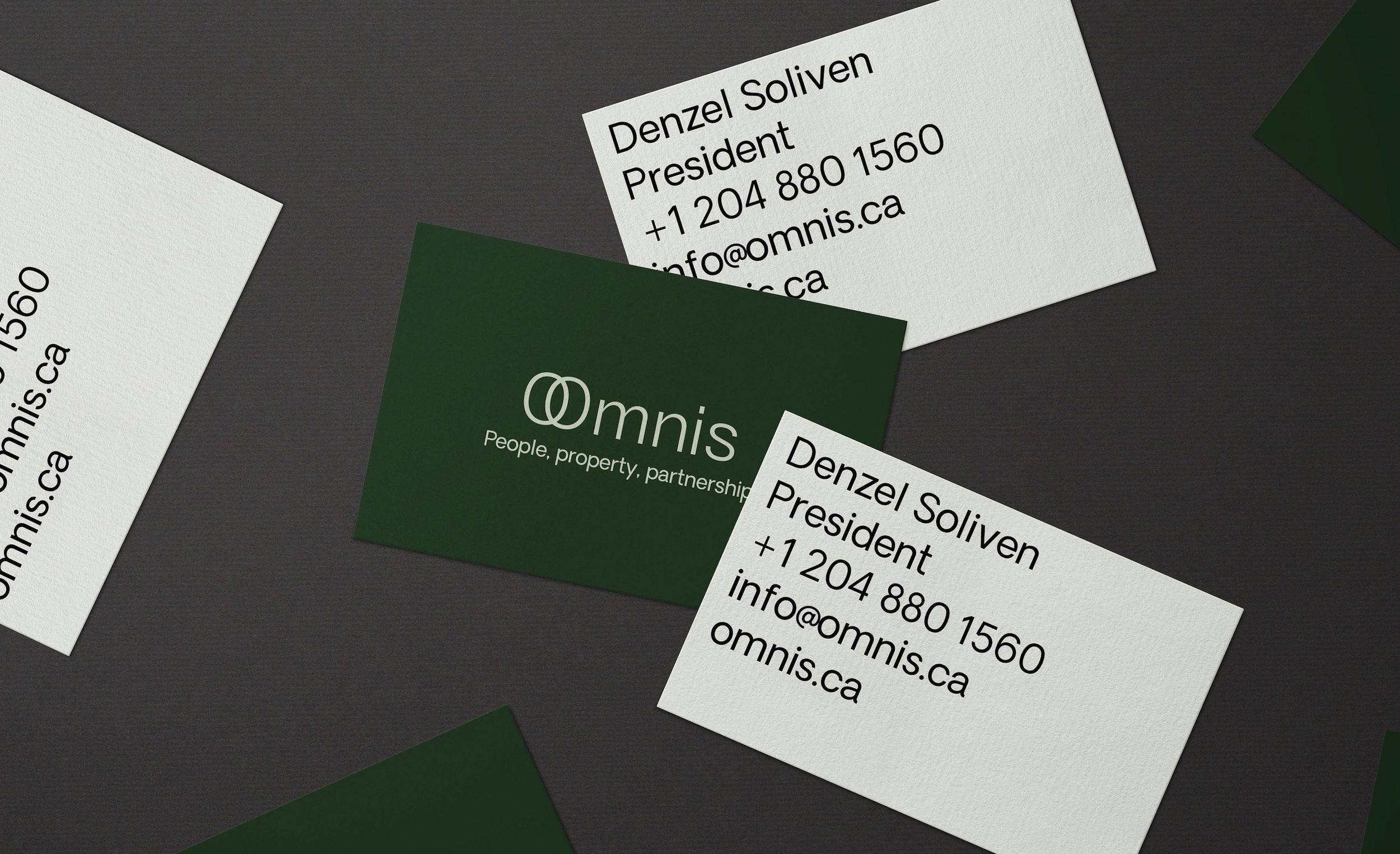

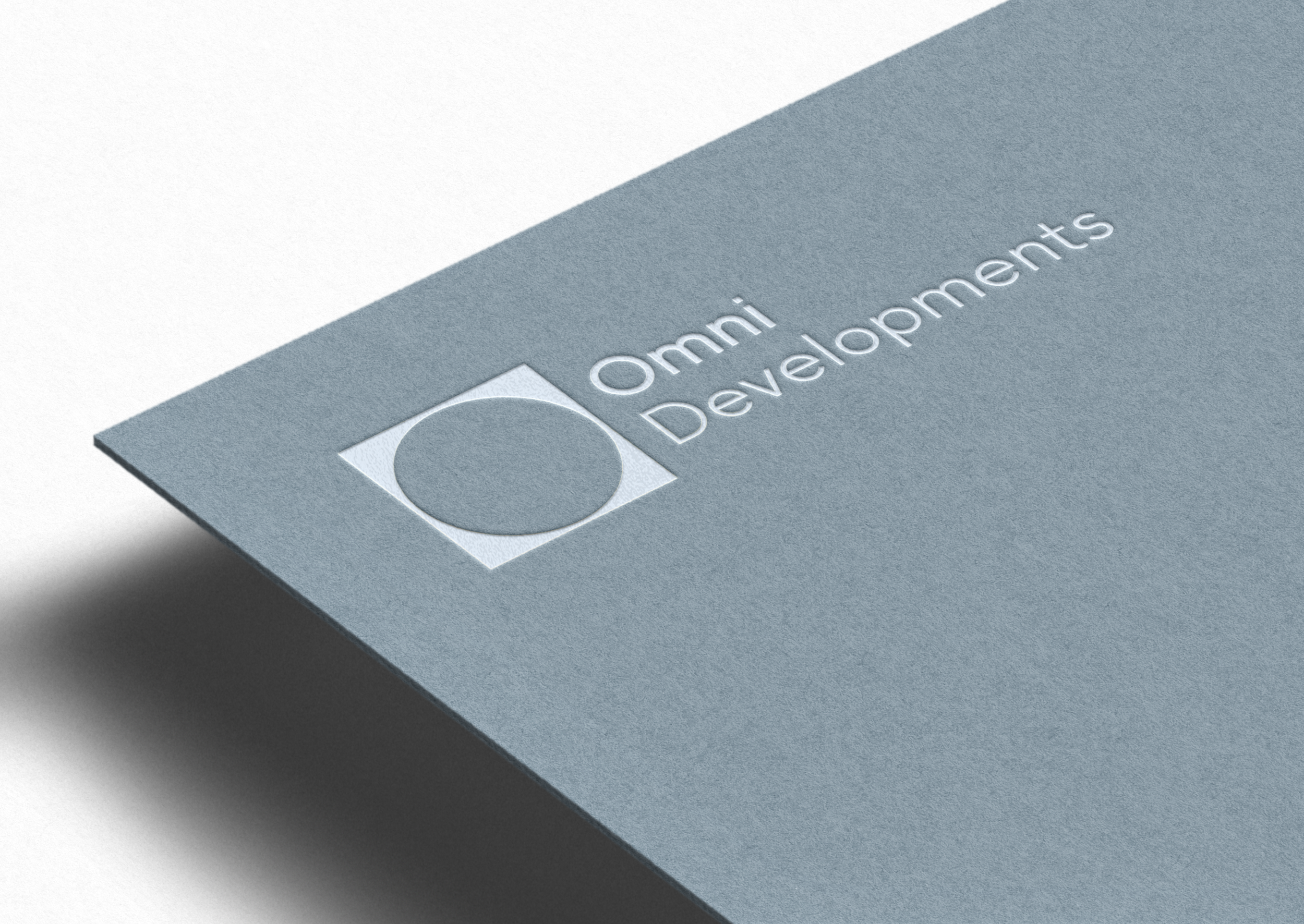
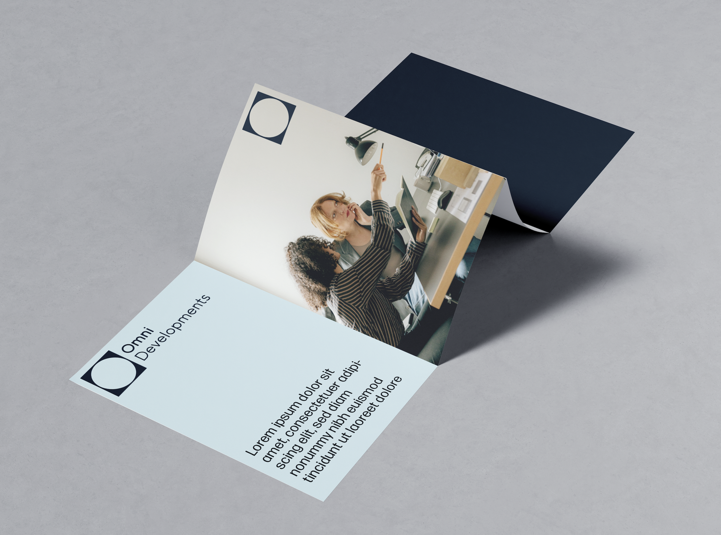
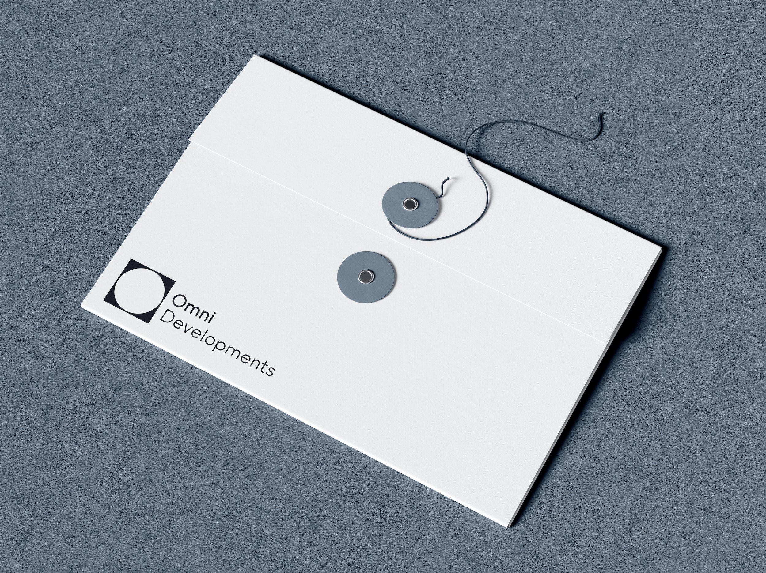
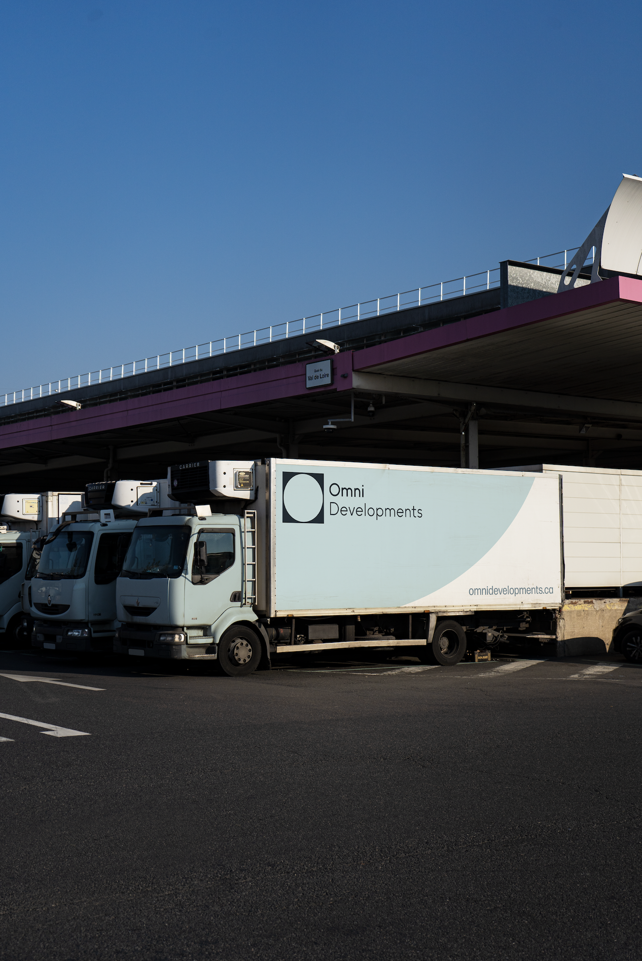
The Omni Sister Idenitiy are businesses in the Property Management + Building sector. It has two branches - Omni Developments and Omnis. The two logos imply their professional tone and manner. The logos represent the building blocks of these brands and connections between the business and the user. Rich + Calming colours are used throughout both brands to show unity. Omnis + Omni both use the same Font Parings for easy use. The overall feeling of these brands is refreshing and stylish. They will stand out among competitors.
+ Brand Design
+ Logo Design
Omni Developments — Sister Identity
Omnis — Sister Identity